
As a data analyst, a first step to any data related project is to ask – does my dataset make sense? From my decade of working with financial assets, I can attest that when your data is garbage, your conclusions are garbage, and put frankly, you returns will reflect this garbage. Similarly, data that looks wrong may not actually be wrong, but where financial markets are concerned, it could signal an opportunity to make money until the markets start showing sensible behavior again.
So let us begin. Our dataset is the Treasury yield curve for the period between 10/19/2017 to 11/30/2017 (30 quote-days in total) acquired from the US Treasury’s website. The treasury yield curve represents how much return (on an annualized basis) you can expect to make by purchasing treasury debt that the US government will repay in 1 month, 3 months, 1 year, … all the way to 30 years – i.e. the yield of such debt. How this data is calculated and published is not as important for what we will do here and now, but both the US Treasury department and the Federal Reserve have a heavy hand in “shaping” this curve.
So the first step to any data project is to take a look at the data:
| Date | 1 Mo | 3 Mo | 6 Mo | 1 Yr | 2 Yr | 3 Yr | 5 Yr | 7 Yr | 10 Yr | 20 Yr | 30 Yr |
| 19-10-17 | 0.99 | 1.1 | 1.25 | 1.41 | 1.58 | 1.69 | 1.98 | 2.18 | 2.33 | 2.6 | 2.83 |
| 20-10-17 | 0.99 | 1.11 | 1.27 | 1.43 | 1.6 | 1.72 | 2.03 | 2.24 | 2.39 | 2.67 | 2.89 |
| 23-10-17 | 1 | 1.09 | 1.25 | 1.42 | 1.58 | 1.7 | 2.01 | 2.22 | 2.38 | 2.66 | 2.89 |
| 24-10-17 | 1 | 1.12 | 1.27 | 1.43 | 1.6 | 1.73 | 2.05 | 2.26 | 2.42 | 2.7 | 2.92 |
| 25-10-17 | 1.01 | 1.12 | 1.27 | 1.43 | 1.61 | 1.74 | 2.06 | 2.28 | 2.44 | 2.72 | 2.95 |
| 26-10-17 | 0.99 | 1.11 | 1.29 | 1.43 | 1.63 | 1.76 | 2.07 | 2.3 | 2.46 | 2.74 | 2.96 |
| 27-10-17 | 0.98 | 1.1 | 1.28 | 1.42 | 1.59 | 1.73 | 2.03 | 2.26 | 2.42 | 2.71 | 2.93 |
| 30-10-17 | 0.97 | 1.12 | 1.24 | 1.42 | 1.58 | 1.71 | 2 | 2.22 | 2.37 | 2.66 | 2.88 |
| 31-10-17 | 0.99 | 1.15 | 1.28 | 1.43 | 1.6 | 1.73 | 2.01 | 2.23 | 2.38 | 2.66 | 2.88 |
| 01-11-17 | 1.06 | 1.18 | 1.3 | 1.46 | 1.61 | 1.74 | 2.01 | 2.22 | 2.37 | 2.63 | 2.85 |
| 02-11-17 | 1.02 | 1.17 | 1.29 | 1.46 | 1.61 | 1.73 | 2 | 2.21 | 2.35 | 2.61 | 2.83 |
| 03-11-17 | 1.02 | 1.18 | 1.31 | 1.49 | 1.63 | 1.74 | 1.99 | 2.19 | 2.34 | 2.59 | 2.82 |
| 06-11-17 | 1.03 | 1.19 | 1.3 | 1.5 | 1.61 | 1.73 | 1.99 | 2.17 | 2.32 | 2.58 | 2.8 |
| 07-11-17 | 1.05 | 1.22 | 1.33 | 1.49 | 1.63 | 1.75 | 1.99 | 2.17 | 2.32 | 2.56 | 2.77 |
| 08-11-17 | 1.05 | 1.23 | 1.35 | 1.53 | 1.65 | 1.77 | 2.01 | 2.19 | 2.32 | 2.57 | 2.79 |
| 09-11-17 | 1.07 | 1.24 | 1.36 | 1.53 | 1.63 | 1.75 | 2.01 | 2.2 | 2.33 | 2.59 | 2.81 |
| 10-11-17 | 1.06 | 1.23 | 1.37 | 1.54 | 1.67 | 1.79 | 2.06 | 2.27 | 2.4 | 2.67 | 2.88 |
| 13-11-17 | 1.07 | 1.24 | 1.37 | 1.55 | 1.7 | 1.82 | 2.08 | 2.27 | 2.4 | 2.67 | 2.87 |
| 14-11-17 | 1.06 | 1.26 | 1.4 | 1.55 | 1.68 | 1.81 | 2.06 | 2.26 | 2.38 | 2.64 | 2.84 |
| 15-11-17 | 1.08 | 1.25 | 1.39 | 1.55 | 1.68 | 1.79 | 2.04 | 2.21 | 2.33 | 2.58 | 2.77 |
| 16-11-17 | 1.08 | 1.27 | 1.42 | 1.59 | 1.72 | 1.83 | 2.07 | 2.25 | 2.37 | 2.62 | 2.81 |
| 17-11-17 | 1.08 | 1.29 | 1.42 | 1.6 | 1.73 | 1.83 | 2.06 | 2.23 | 2.35 | 2.59 | 2.78 |
| 20-11-17 | 1.09 | 1.3 | 1.46 | 1.62 | 1.77 | 1.86 | 2.09 | 2.26 | 2.37 | 2.6 | 2.78 |
| 21-11-17 | 1.15 | 1.3 | 1.45 | 1.62 | 1.77 | 1.88 | 2.11 | 2.27 | 2.36 | 2.58 | 2.76 |
| 22-11-17 | 1.16 | 1.29 | 1.45 | 1.61 | 1.74 | 1.84 | 2.05 | 2.22 | 2.32 | 2.57 | 2.75 |
| 24-11-17 | 1.14 | 1.29 | 1.45 | 1.61 | 1.75 | 1.85 | 2.07 | 2.23 | 2.34 | 2.58 | 2.76 |
| 27-11-17 | 1.15 | 1.27 | 1.41 | 1.62 | 1.74 | 1.84 | 2.06 | 2.21 | 2.32 | 2.57 | 2.76 |
| 28-11-17 | 1.16 | 1.3 | 1.46 | 1.61 | 1.75 | 1.85 | 2.07 | 2.24 | 2.34 | 2.58 | 2.77 |
| 29-11-17 | 1.17 | 1.29 | 1.45 | 1.61 | 1.78 | 1.86 | 2.09 | 2.27 | 2.37 | 2.62 | 2.81 |
| 30-11-17 | 1.14 | 1.27 | 1.44 | 1.62 | 1.78 | 1.9 | 2.14 | 2.31 | 2.42 | 2.65 | 2.83 |
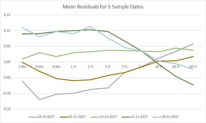
And graph a few sample dates:
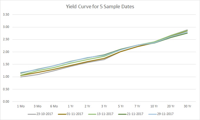
As you see in the graph, the data has a certain shape with some variations for the various dates. Next, let us break the data by inserting anomalies. A 0.1 increase or decrease in the rate should suffice. And here is how this looks for the above 5 sample dates:
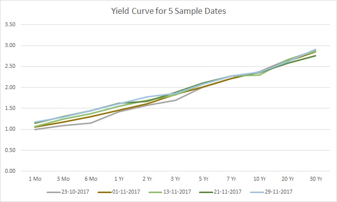
See the difference? It’s clear that something is different, but spotting all the anomalies may not be so easy, even by visual inspection. The changes were as follows:
- The 6-month rate on 23-10 was decreased by 0.1
- The 3-year rate on 1-11 was increased by 0.1
- The 10-year rate on 13-11 was decreased by 0.1
- The 2-year rate on 21-11 was decreased by 0.1
- The 30-year rate on 29-11 was increased by 0.1
So with this basic setup, let us load our data into python and prepare the anomalies:
import numpy as np
import pandas as pd

data = pd.read_csv("./yc.csv").values
corrupt = data.copy()
corrupt[2, 3] = corrupt[2, 3] - 0.1
corrupt[9, 5] = corrupt[9, 5] + 0.1
corrupt[17, 8] = corrupt[17, 8] - 0.1
corrupt[23, 4] = corrupt[23, 4] - 0.1
corrupt[28, 10] = corrupt[28, 10] + 0.1
In the next part we will consider what it means to learn in an unsupervised way, a step that is quite important to understand why the technique we will eventually use to detect the anomalies actually works.
Take a look at the sample data depicted in Figure 1 again. Regardless of the date, the yield curve has a specific shape that generally describes most of the curves, with a bit of variation. In simple terms, we might say that the data can be summarized by a single shape, and the shape of each yield curve is close to, or clusters around, this single summary shape.
This is precisely what unsupervised learning entails – summarizing how the data is organized in some special way – i.e. by some model. For example, if we describe each yield curve with the vector  , then we can describe the likelihood of observing any particular using a probability density function,
  , where
  is some parameter set. In the case of a time-series, can depend on time for an arbitrary model, in which case it will be very difficult to arrive at conclusions that do not change with time. However, in most cases we can find some way to describe the relationships in the data differently so as to remove this dependence, in which case we call our model stationary.
To get a sense of what model could be appropriate, let us graph some of the yield rates against the others. For example, we can compare the 1-year vs. the 3-year, the 3-year vs. the 5-year, the 5-year vs. the 20-year, and the 1-year vs. the 20-year rates as follows:
fig, axs = plt.subplots(2,2)
fig.subplots_adjust(hspace=0.35, wspace=0.35)

axs[0,0].plot(data[:,3], data[:,5], linestyle='None', marker='.')
axs[0,0].set_xlabel('1-year')
axs[0,0].set_ylabel('3-year')
axs[0,0].grid(True)
axs[0,1].plot(data[:,5], data[:,6], linestyle='None', marker='.')
axs[0,1].set_xlabel('3-year')
axs[0,1].set_ylabel('5-year')
axs[0,1].grid(True)
axs[1,0].plot(data[:,6], data[:,9], linestyle='None', marker='.')
axs[1,0].set_xlabel('5-year')
axs[1,0].set_ylabel('20-year')
axs[1,0].grid(True)
axs[1,1].plot(data[:,3], data[:,9], linestyle='None', marker='.')
axs[1,1].set_xlabel('1-year')
axs[1,1].set_ylabel('20-year')
axs[1,1].grid(True)

fig.show()
And it would look like this:
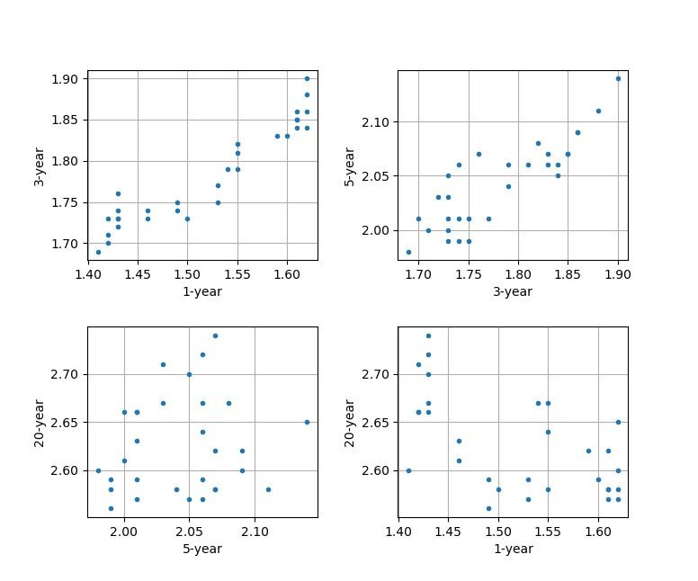
We can start to see that some data points have linear relationships between them to varying degrees, but for the most part the data clusters. We can test this relationship via a linear model:

 is the sample mean,
  is the sample covariance, and
  is a standard normally distributed random value.
This model corresponds to the probability density function:

 is the dimension of the data set, in this case 11.
So if the data is normally distributed, then we can check that any single is an outlier with 96% confidence if  , which is the chi-score – normally you might hear of Pearson’s test or the Binomial test that uses the chi-square distribution, which is the same; but here I want to emphasize the test’s derivation.
dataM = np.mean(data, 0)
dataC = data - dataM
dataCov = np.matmul(dataC.transpose(), dataC)/(data.shape[0]-1)
dataZ = np.sqrt(np.diagonal(np.tensordot(np.matmul(dataC, np.linalg.inv(dataCov)), dataC, axes=[1, 1])))

corruptM = np.mean(corrupt, 0)
corruptC = corrupt - corruptM
corruptCov = np.matmul(corruptC.transpose(), corruptC)/(data.shape[0]-1)
corruptZ = np.sqrt(np.diagonal(np.tensordot(np.matmul(corruptC, np.linalg.inv(corruptCov)), corruptC, axes=[1, 1])))

# plot the z-scores
fig, axs = plt.subplots(2,1)
fig.subplots_adjust(hspace=0.35, wspace=0.35)

axs[0].hist(dataZ, bins=11)
axs[0].set_xlabel('Z-Score')
axs[0].set_ylabel('Data Freq')
axs[1].hist(corruptZ, bins=11)
axs[1].set_xlabel('Z-Score')
axs[1].set_ylabel('Corrupt Freq')

lims = [min(np.min(dataZ),np.min(corruptZ))-1, max(np.max(dataZ),np.max(corruptZ))+1]
axs[0].set_xlim(lims)
axs[1].set_xlim(lims)
fig.show()

# print the outliers
print(np.max(dataZ))
# Output: 4.132
print(corruptZ[2],corruptZ[9],corruptZ[17],corruptZ[23],corruptZ[28])
# Output: 4.711 5.056 5.157 5.023 5.106
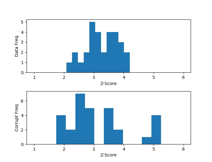
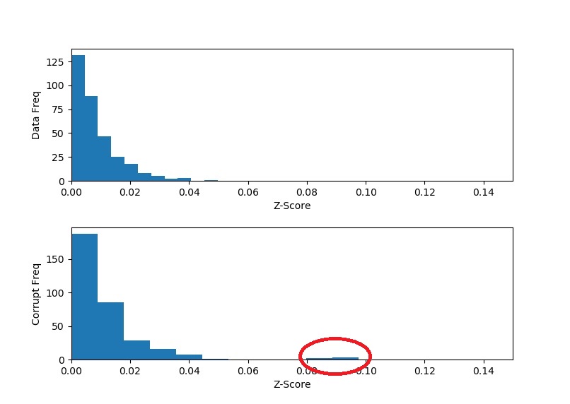
Comparing the histograms of the real and corrupted data, as well as checking the print-outs, we can see that in the corrupt data there are exactly 5 outliers with very large chi-scores that correspond exactly to the dates that we bumped. Furthermore, because bumping the data caused the overall variance of the data to increase, we see that the anomalous data was in fact pushed to the right (higher chi-scores), but also that the untouched data was pushed to the left (lower chi-scores). That is because the untouched data now deviates relatively less when compared to the higher overall variance that was introduced by the anomalies.
And here is a good opportunity to take note that the shape of the chi-scores of the untouched data is not 1-sided normally distributed (remember that we only have positive values here). Don’t be alarmed – this in no way indicates that our data is not normally distributed. The distribution we are looking at is the square root of a chi-squared distribution – the chi-distribution. This distribution models the sum of square of independent, identically normally distributed variables. In our case, we have 11 variables, so we should be observing the chi-distribution with 11 degrees of freedom.
So of the smallest chi-scores, 4.711 indicates a 97.7% confidence that this point is an outlier – a pretty good indication. However, this method still has some drawbacks. While we know that something is wrong with these 5 specific data points, we don’t know the exact source of the problem. Is it because the 1-year rate is bad or is it because the 3-year and 10-year rates are wrong? We have no way of knowing. And this happens because we rely on the joint distribution; and why we need to employ principal component analysis, which we will do in the next section.
Look at Figure 3 again, and you will spot that some yield rates are highly correlated, to the point where knowing one rate means knowing the other with almost certainty. We can exploit this property by looking at these correlations as arising from a single factor that controls multiple rates. This technique is known as principle component analysis.
What we look for are fundamental shapes, say  to
to  , where
  ,
,  (1 when
  and 0 otherwise), and where most of the variation is captured by the first fundamental shape , followed by the second most variation captured by the second, and so forth. To get a better understanding of this issue, let’s take a look at the mean residuals of our untouched 5 dates:
While not as obvious – and perhaps this is where looking at an even larger sample would help spot the pattern – it would seem that the residuals have a similar shape up to some scaling factor. Stated differently for this particular example, the variations are more pronounced in the expiration dates of 1 month to 3 years, and then these variations lessen in intensity up to 10 years, where finally the variations flip in direction and intensify for the final expiration years. You can think of the shape as if catching quick snapshots of a guitar string vibrating – the shape is the same, but the amplitude changes. Now compare this to the mean residuals after the bumps:
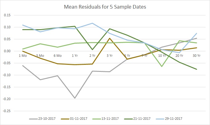
Looking at the data from this perspective, the anomalies stand out clearly.
The solution to this problem is given by the polar decomposition of the covariance matrix. That is, we are looking to rotate and stretch our coordinate space of the yield rates, so that rather than describe the curves using the 1-month, 3-month, so on and so forth up to 30-year rates, we describe the curves using a smaller set of factors that do just as good of a job describing the variation between the different curves.
In other words, what we are looking to decompose is:

 is an orthogonal matrix – or the rotation – and
  is a diagonal matrix – or the stretching. But it is also like asking to decompose:
So looking back at our linear model, our principle factor scaling or scores are actually the values of in  , and if you never knew that, then now you know. The reason why we even need to bother with polar decomposition (or SVD) stems from here.
Given any positive-definite matrix (the covariance matrix) a decomposition such as is not unique. However, there is a unique decomposition (up to reflection and transposition of coordinates) into singular values. And it just so happens that this decomposition also gives us the principal components that we are seeking in this problem, and as a result, a suitable  . For example, let us look at the first component:
U, S, V = np.linalg.svd(dataCov)

fig, axs = plt.subplots(1,1)
axs.plot(V[0])
axs.set_xlabel('Maturity Index')
axs.set_ylabel('PC Sensitivity')
fig.show()
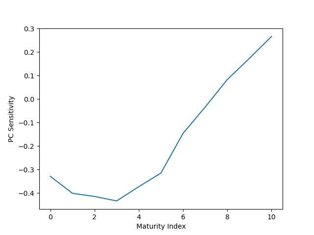
Figure 7 shows us the first principle component, the one that is supposed to capture the most variation in the data. Notice how the first 6 yield rates, corresponding to the 1-month to 3-year rates, have the strongest sensitivity. Then this sensitivity decreases to 0 and then flips in the other direction as we go up to the last yield rate. Compare that to the sensitivity we described when observing our 5 sample dates. So let us take all of this knowledge and develop some technique to detect whether rate  is anomalous – that is, the rate at maturity
  for date
  .
.
To tackle such a problem, we first need to take inventory of what information we have and what information is being questioned. Firstly, we should make an assumption that most of the data is not corrupt, and 5 data points out of 363 (11 times 30) is fine – generally, if a significant amount of the data is severely corrupted, we may not be able to recover any reasonable information from the data anyways. Secondly, given that we are questioning data point , and by our first assumption, we can safely assume that we can calculate the data mean and covariance matrix using the rest of the data. Thirdly, given that we are questioning rate out of the other 10 rates, we should make the assumption that only a few of these other rates may be corrupt, so that we can hope to reconstruct our principal factors . So we are looking a the likelihood of  given
given  , (which we have from our SVD), and
 ![[y_{t,0} ... y_{t,\tau-1}, y_{t,\tau+1} ... y_{t,N}]](https://www.riskideas.com/wp-content/ql-cache/quicklatex.com-3ce96de6bcf055213ce71c2c9a2beebb_l3.png "Rendered by QuickLaTeX.com") (the other rates for this data point).
(the other rates for this data point).
If we expand the linear model, we have the following:

 factors, with the assumption that the rest of the factors arise from noise or are just too small to distinguish them from noise. Note that instead of multiplying by , we are multiplying by the unstretched, first vectors of , which we will denote with
  . The reason we can do this is because when solving for , the only difference is that each coordinate will be multiplied by this scaling factor that we omitted. Since we don’t really care about these factors in the end result, it is irrelevant to us if they are scaled arbitrarily.
Next, notice that this equation can be written slightly differently to help us solve for :

 is a vector of zeros with -1 at the entry. And this way we have a linear regression with equations and
  unknowns of the form
  , where:
by the solution of the least squares linear regression:  .
.
But before we see it in action, let us discuss how we pick the dimensionality reduction index . The hint for that comes from our diagonal matrix  , which provides us with the eigenvalues of our covariance matrix. These eigenvalues tell us how much variance is captured in each principal component, or eigenvector. Therefore, if the eigenvalues are so small that they are already much smaller then the residual eigenvalues – the variation that we assume to arise from noise – then adding the respective principal component to the equation can lead to unstable results, and we are better off by not including those components. In our corrupt data, only the first two principle components are significantly large enough to withstand this criteria. Therefore, we will use an
  in the below analysis, but try out other values for as an exercise and sanity check. Now all that is left is to compare to , and here is how we put it all together in code:
# get the components
U, S, V = np.linalg.svd(dataCov)
Uc, Sc, Vc = np.linalg.svd(corruptCov)

L=2
dataZ = np.ndarray(shape=data.shape)
corruptZ = np.ndarray(shape=data.shape)

# iterate over the data
for i in range(data.shape[0]):
    for j in range(data.shape[1]):
        # get y in the regression equation
        dataR = dataC[i].copy()
        dataR[j] = -dataM[j]

        corruptR = corruptC[i].copy()
        corruptR[j] = -corruptM[j]

        # construct X in the regression equation
        One = np.zeros([1, 11])
        One[0,j] = -1
        X = np.concatenate([V[:L], One], 0)
        Xc = np.concatenate([Vc[:L], One], 0)

        # get the difference between the expected value for each rate based on the other rates
        # and the rate that was actually observed in the data
        dataZ[i,j] = np.matmul(np.matmul(np.linalg.inv(np.matmul(X, X.transpose())), X), dataR)[-1] - data[i,j]
        corruptZ[i,j] = np.matmul(np.matmul(np.linalg.inv(np.matmul(Xc, Xc.transpose())), Xc), corruptR)[-1] - corrupt[i,j]

# plot the histogram of differences between y-hat and y
fig, axs = plt.subplots(2,1)
fig.subplots_adjust(hspace=0.35, wspace=0.35)

axs[0].hist(np.abs(dataZ.flatten()), bins=11)
axs[0].set_xlabel('Z-Score')
axs[0].set_ylabel('Data Freq')
axs[1].hist(np.abs(corruptZ.flatten()), bins=11)
axs[1].set_xlabel('Z-Score')
axs[1].set_ylabel('Corrupt Freq')

lims = [0, 0.15]
axs[0].set_xlim(lims)
axs[1].set_xlim(lims)
fig.show()

print(np.max(np.abs(dataZ)))
# Output: 0.0497
print(corruptZ[2,3],corruptZ[9,5],corruptZ[17,8],corruptZ[23,4],corruptZ[28,10])
# Output: 0.0809 -0.0914 0.0956 0.0869 -0.0976
A couple of things to notice about the results. Firstly, the outliers in the corrupt data are significantly farther away from the main body of histogram – compare this result if you were to chose a different value for . Secondly, we hit exactly all the anomalous points in the corrupt data. Thirdly, we found the exact part of each data row that caused the anomaly – compare this to our first technique where we could only find the offending row. And fourthly, our “z-scores” (because they are not normalized) are in the direction of the error/bump.
If we would like to automate this using actual z-scores we could do the following:
czm = np.mean(corruptZ)
czs = np.std(corruptZ)
corruptZ = (corruptZ - czm)/czs
print(corruptZ[2,3],corruptZ[9,5],corruptZ[17,8],corruptZ[23,4],corruptZ[28,10])
# Output: 4.645 -5.245 5.483 4.989 -5.601
Noting that the smallest z-score, 4.645, corresponds to a 99.99983% confidence that this is an outlier – not bad at all!
As a homework exercise, consider why we can model these errors using a normal distribution and, therefore, utilize a z-test. Hint: it has to do with the underlying assumption of a least squares regression. Solution
In closing, I hope that you enjoyed this tour of anomaly detection. I read a lot of posts out there on both supervised learning and PCA, and with this tour I wanted to give you, the reader, something different:
- A bit more practical, using real data;
- A hands on approach, where you work through the problem and visualize the details instead of simply taking my word for it;
- And, finally, a useful technique that you can feel confident in repeating elsewhere to get tangible results.